WHY EVERY WORLD MAP IS WRONG

In reality, how many Greenlands could fit in Africa?
So, why does Greenland look so big on almost every flat map you see?
Why is it so hard to make an accurate flat map of the Earth?
What are the two types of line in Ptolemy’s grid?
How many of each type of line are there?
In Gerardus Mercator’s world map, what happens to the shape of continents and oceans that are further away from the equator?
What’s the problem with the Goode Homolosine Projection (aka, the “orange peel map”)?
Who created the most accurate flat map today? (Hint: He was an architect.)
What is the most accurate flat map called?
Even though the Mercator projection map works for navigation, Arno Peters says there’s a big problem with it. What’s the problem?

• READ •
WHY EVERY WORLD MAP IS WRONG
Intro
Fourteen Greenlands could fit in Africa, but you wouldn’t guess it from most maps of the world.

The fact is, every world map humans have ever made is wrong.
Actually, it’s impossible to make a map of the world 100% right.

No, not you, globe— we know you’re accurate. Not you, Google Earth, you’re just a digital globe.
We're talking about flat maps, which, let's face it, are way more convenient for a lot of things. Anyway, as we were saying, it’s impossible to make a 100% accurate flat map of a spherical planet.
For a long time, people didn't even try. They just plonked places down in arbitrary locations without any consistent scale.
The Grid
Then in 150 AD, the Greek mathematician and astronomer Ptolemy systematically mapped the Earth on a grid and placed locations on the grid according to coordinates, so maps could be checked against others and replicated.

Ptolemy built his grid out of lines we still use today: 180 lines of latitude and 360 lines of longitude. In spite of these advances, people kept getting lost.
The Route
Part of the problem was a— shall we say— incomplete understanding of the world’s geography.
But it was also just really difficult to navigate using a map. Because the Earth is round, the shortest route from one place to another is a path along a circle.
If we draw this route on a flat map, it passes through every line of longitude at a different angle. To follow the route, you’d have to constantly shift the direction you're traveling. Any slight error would land you in the wrong place.

In 1569, Gerardus Mercator fixed this problem.
He created a world map proportioned so these curved navigational routes would be straight, passing through every line of longitude at the same angle and therefore allowing navigators to set a constant bearing— in other words, travel in one direction— for a whole journey.
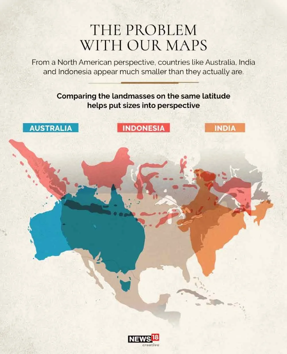
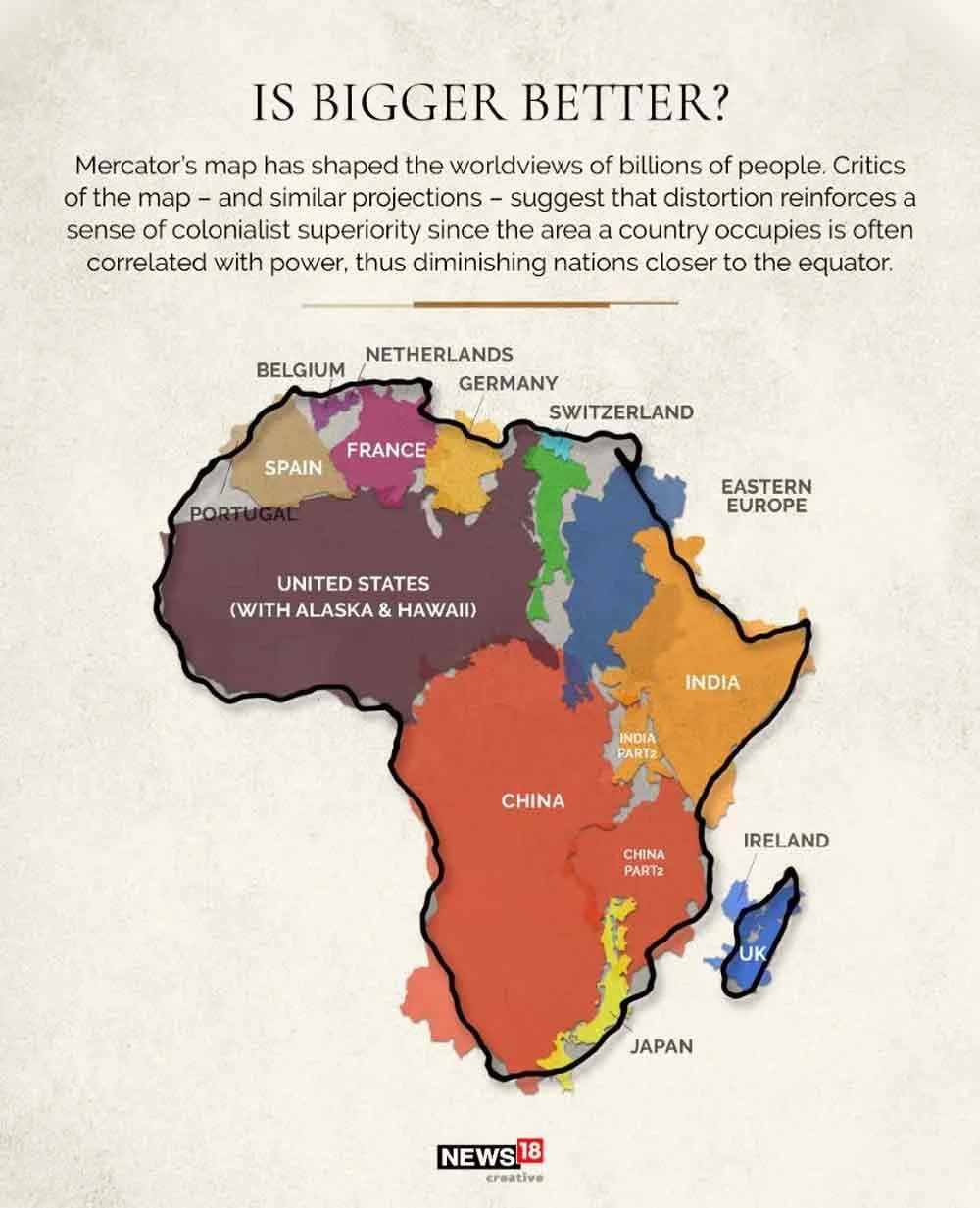
There was just one tiny hitch: to do this, he had to distort land masses and bodies of water so those furthest from the equator got larger and those closest to the equator shrank. In spite of its inaccuracies, Mercator’s map was very useful.
In fact, it’s still widely used today, including in online maps. But it’s still wrong!
The Projection
In 1925, the Goode Homolosine Projection was created as— get this— an interrupted pseudo-cylindrical equal area projection.

What does that mean? Not important.
The point was to minimize distortion for the entire world. The map can be land-oriented... or ocean-oriented.
Either way, the so-called orange peel map isn’t very easy to read.
The Dymaxion Projection by American architect Buckminster Fuller in the 1940s is even better.

Sorry, did we say better? It’s not better if you want to understand where things are in the world. It is better in the sense that there are no visibly evident distortions of the land masses.
Though if you wanted to know, say, how far Brazil is from Nigeria, you won’t get any sense of that from this map.
The most accurate projection to date is the AuthaGraph World Map designed by Japanese architect Hajime Narukawa in 1999.
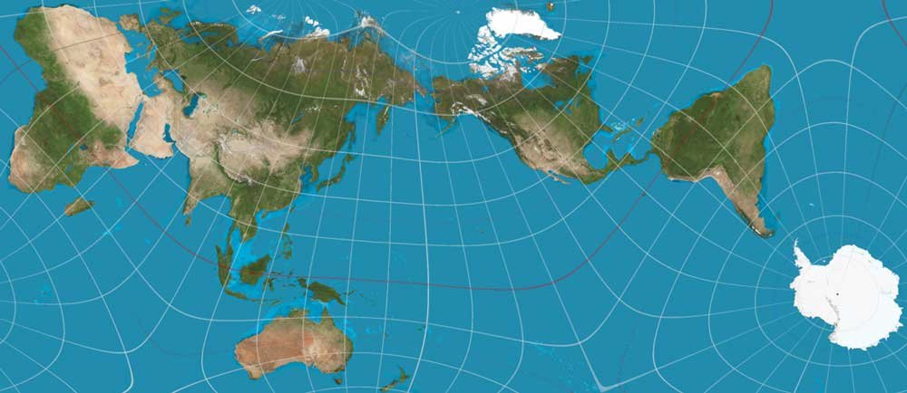
The continents and oceans are almost completely in proportion, and the map is rectangular, just how we like it. Could this be the perfect map?
Why Bother
Well... no. Since the Mercator works for navigation and reads clearly, why bother with all these whacky maps?
Arno Peters argued that by enlarging European and North American countries, the Mercator projection gives white nations a sense of supremacy over non-white nations closer to the equator.

He adapted the Gall-Peters Projection, which counteracts that particular problem, but the continents are still... stretched.
Conclusion
Today, we rely on maps less and less for navigation, but they still play a vital role in education.
Peters was definitely on to something: no matter what map we’re looking at, it’s a story told from the perspective of the map’s creator that in turn shapes—perhaps unduly— our perception of our world.
Simple changes in map design, even changes that have nothing to do with how we transfer a round Earth to a flat surface, can completely shift our point of view.

Distortion – A change in shape or size that makes something look different from how it really is.
Projection – A way to show the round Earth on a flat map.
Latitude – Lines that go sideways across the globe, showing how far north or south a place is.
Longitude – Lines that go up and down on the globe, showing how far east or west a place is.
Navigation – Finding your way from one place to another.
Grid – A set of crossing lines used to find or organize locations.
Equator – An imaginary line around the middle of the Earth.
Supremacy – The idea that one group is better or more important than another.
Accurate – Correct, exact, or true.
Perception – The way you see or understand something.

► COMPREHENSION QUESTIONS
— please answer with complete sentences
In reality, how many Greenlands could fit in Africa?
So, why does Greenland look so big on almost every flat map you see?
Why is it so hard to make an accurate flat map of the Earth?
What are the two types of line in Ptolemy’s grid?
How many of each type of line are there?
In Gerardus Mercator’s world map, what happens to the shape of continents and oceans that are further away from the equator?
What’s the problem with the Goode Homolosine Projection (aka, the “orange peel map”)?
Who created the most accurate flat map today? (Hint: He was an architect.)
What is the most accurate flat map called?
Even though the Mercator projection map works for navigation, Arno Peters says there’s a big problem with it. What’s the problem?

► From EITHER/OR ► BOTH/AND
► FROM Right/Wrong ► Creative Combination
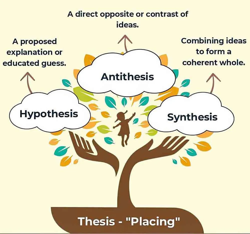
THESIS — One flat map is enough! Argue the case that all we really need is one flat map.
ANT-THESIS — One flat map isnot enough Argue the case that we need several different flat maps.
SYN-THESIS — How might both perspectives be correct?